
Deforestation Infographic
An infographic that “speaks for the trees”
This project was designed to communicate the impact of deforestation and forest loss through an engaging, illustrated infographic. The goal was to transform environmental statistics into an accessible visual story by combining typography, illustration, icons, charts, and data visualization. Rather than presenting the information as a collection of statistics, I used the imagery of a tree as the central visual element, allowing the viewer to move through the information from the scale of global forest loss to its effects on biodiversity, carbon emissions, and human activity.
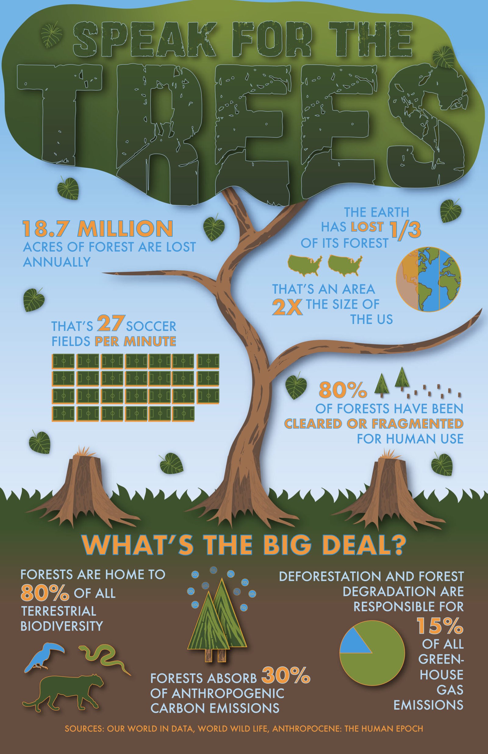
Large statistics can be difficult to understand without visual context, combining illustration and data visualization can make environmental information more approachable. A consistent visual hierarchy helps viewers navigate multiple pieces of information within a single composition. Finally, visual comparisons can make abstract numbers more understandable so it’s important to balance information density with visual engagement.
My big idea was to turn statistics into a visual story to communicate the devastating effects of deforestation, utilizing a large tree to create a focal point and movement throughout the poster.