Slurp’d Beverage Branding
An alcoholic juice box line with an 80’s vibe
A class assignment to create a cohesive brand and packaging collection.
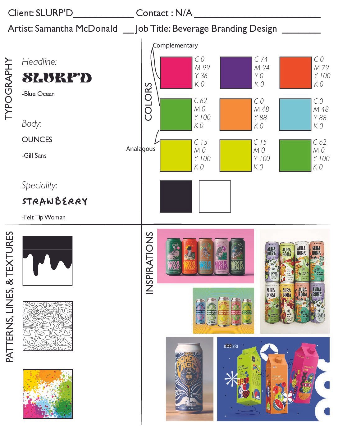
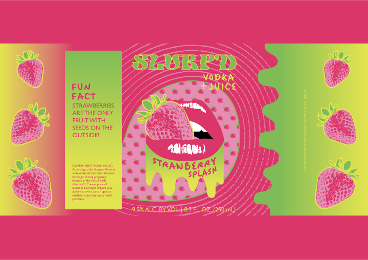
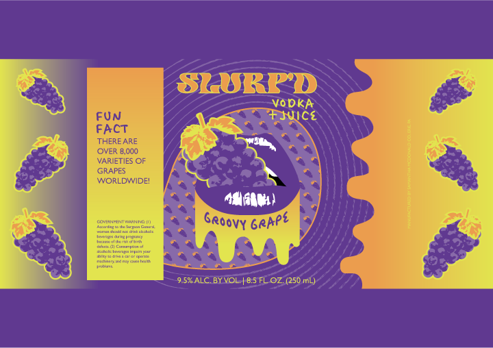
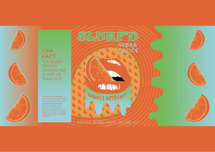
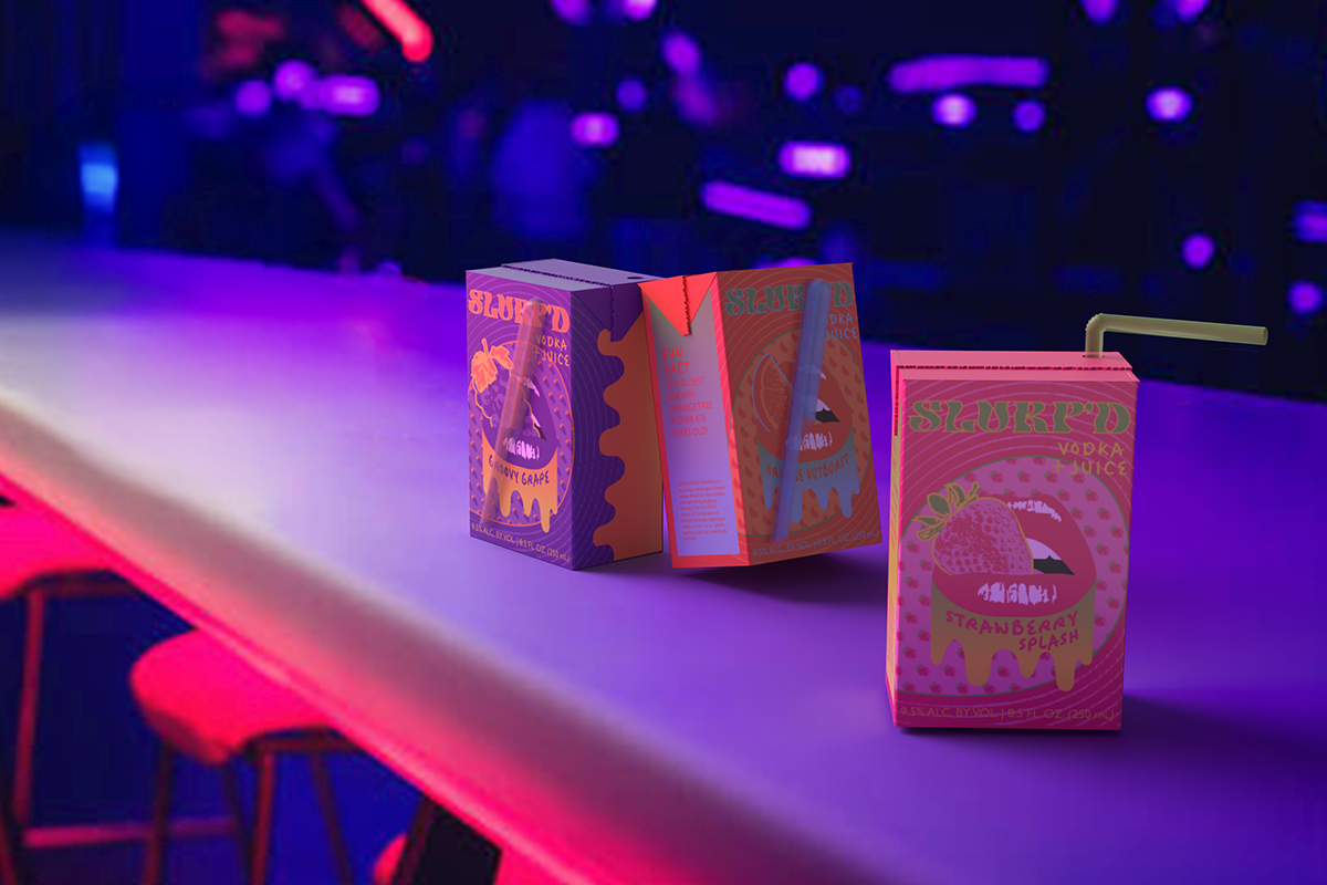
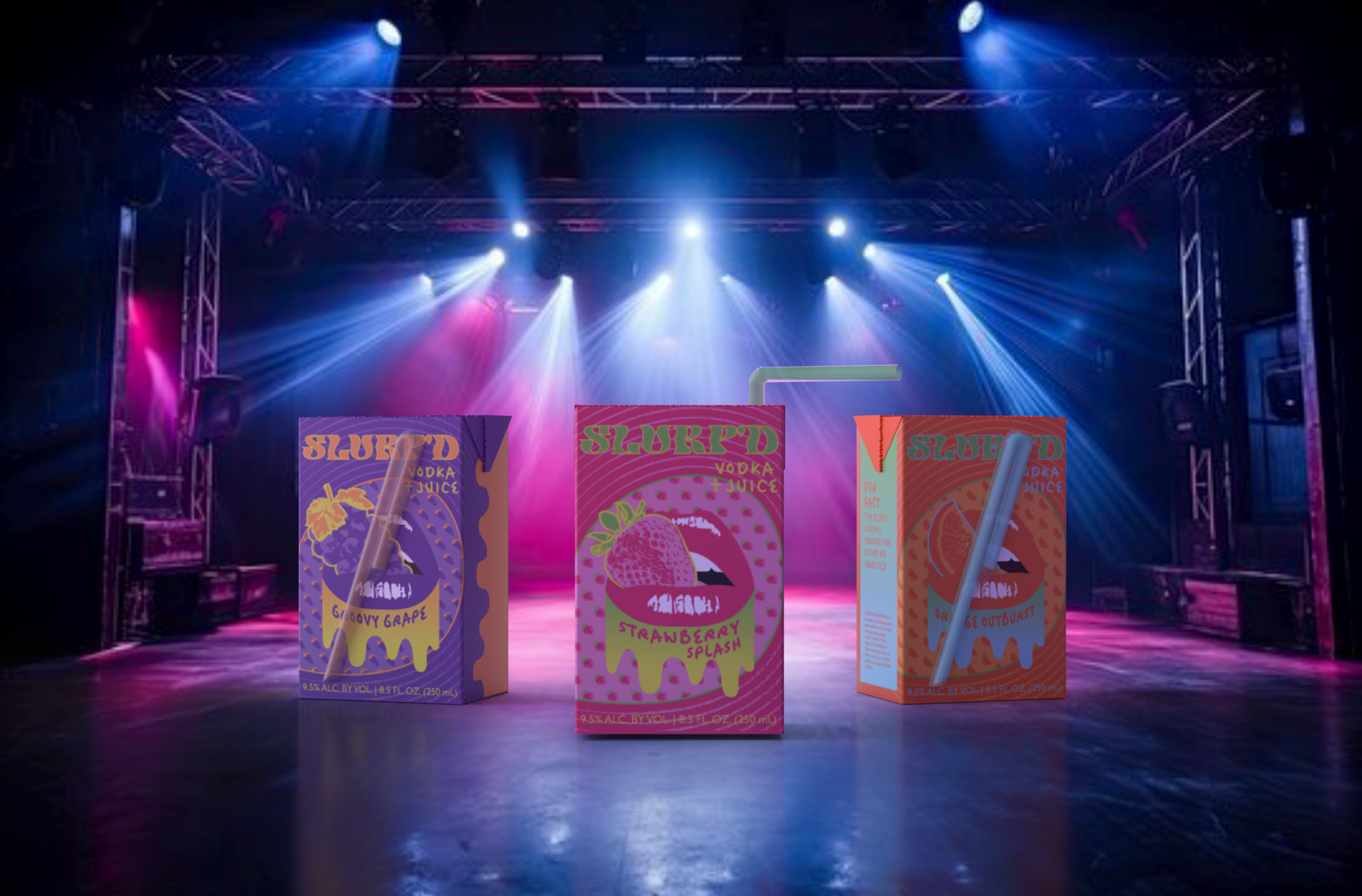
SLURP’D is a playful vodka juice brand designed around nostalgic typography, bold fruit illustration, and psychedelic-inspired visual language. Each flavor uses a distinct color and illustration system while maintaining a consistent brand identity across the collection. This is achieved through keeping the same general layouts and patterns, a unifying central “mouth” image that slightly differs by biting a different fruit across each label, and a saturated color palette.
I created a distinct visual identity that feels nostalgic, playful, and youth-oriented. The combination of psychedelic/retro typography, multiple patterns, highly saturated colors, and dripping elements creates a cohesive personality across the three flavors. The “SLURP’D” wordmark has a warped, retro quality that immediately establishes the personality of the brand, while adding to the maximalist vibe.
Additionally, I made the supporting typography become part of the illustration rather than treating it as separate informational text. The flavor names and supporting text participate in the overall visual composition instead of competing for attention against other elements.
Finally, I designed 3-D juice box forms in Adobe Dimension and overlayed the labels. I then added shadows, lighting, and extra details and texture.
- Moodboard (Brand Colors and Typography)
- Logo Iterations
- 3 Labels
- Mockups (Adobe Dimension)