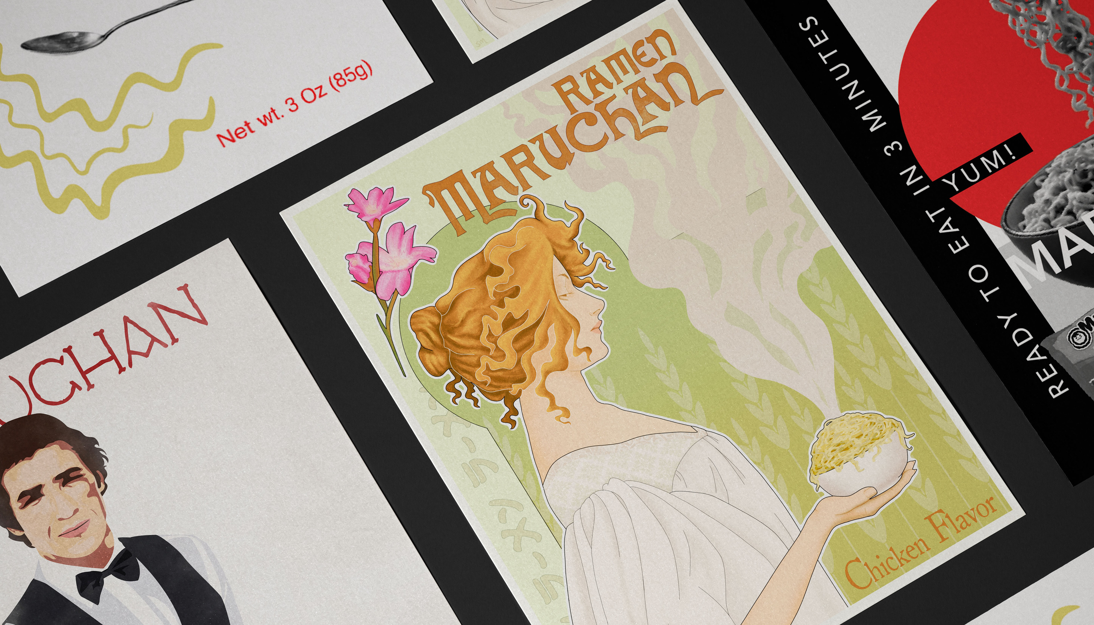

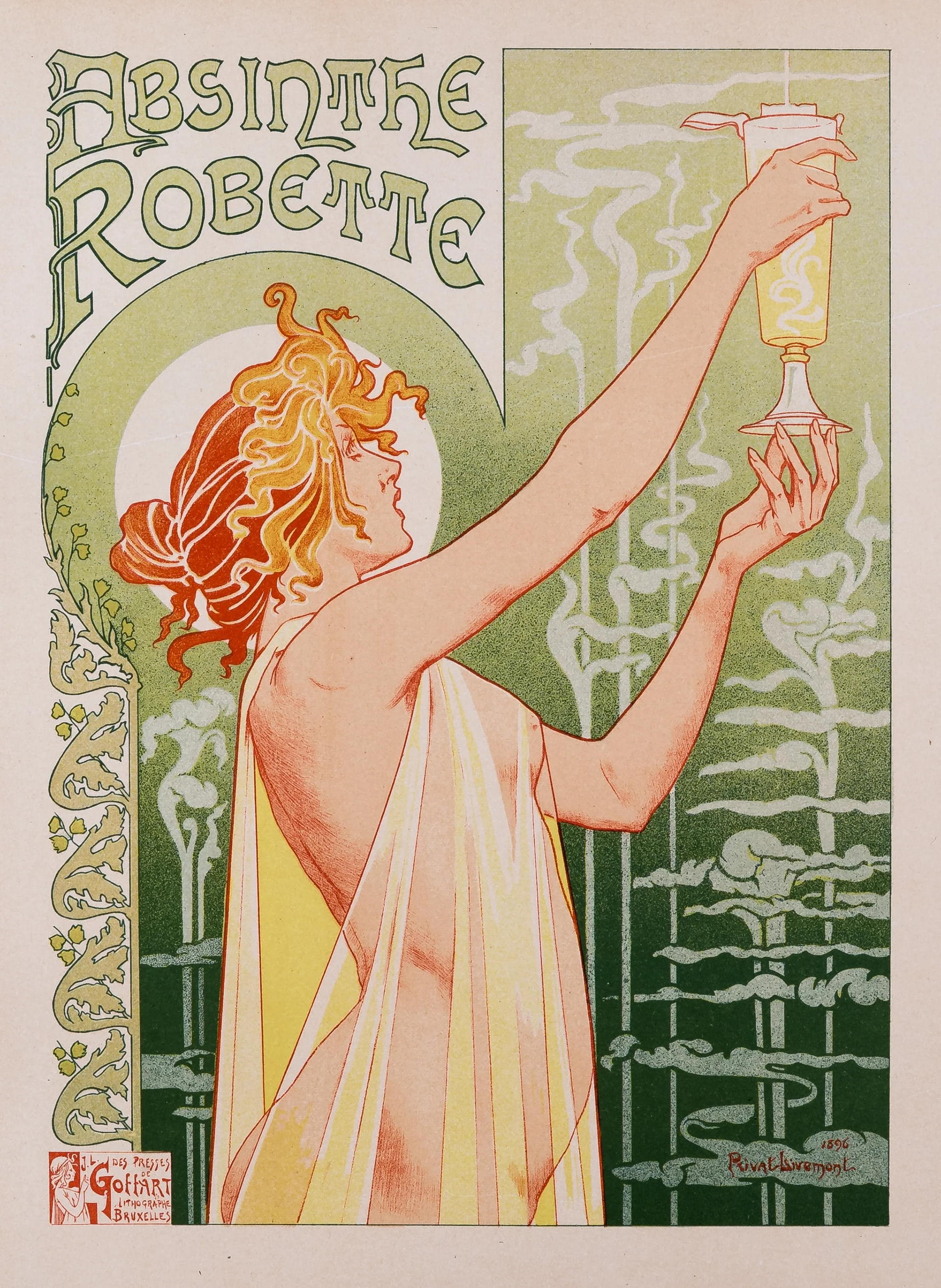
Absinthe Robette, Privat-Livemont, 1896
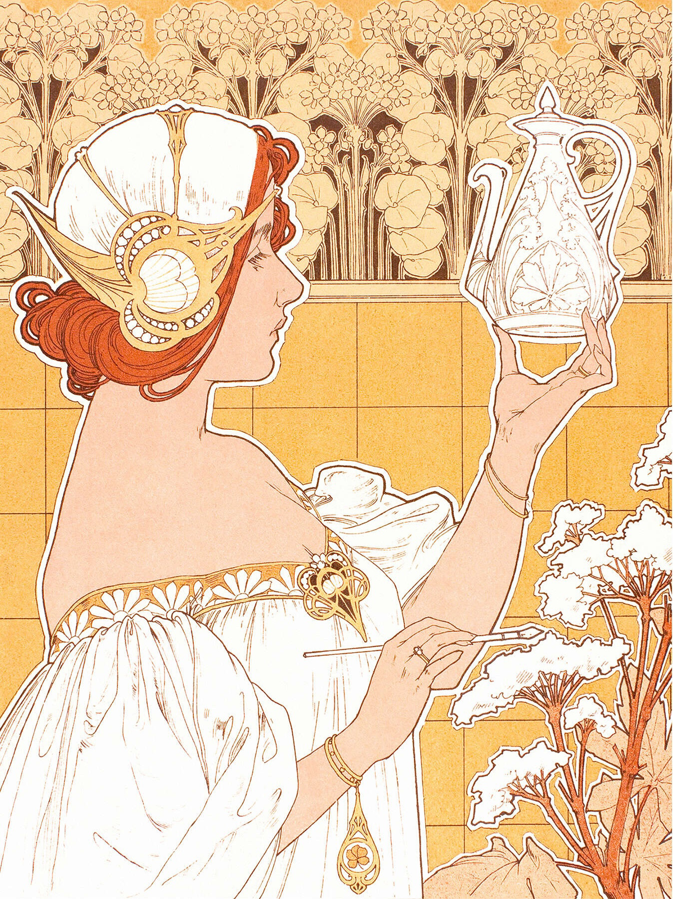
Majolique, Privat-Livemont, 1901
My Design
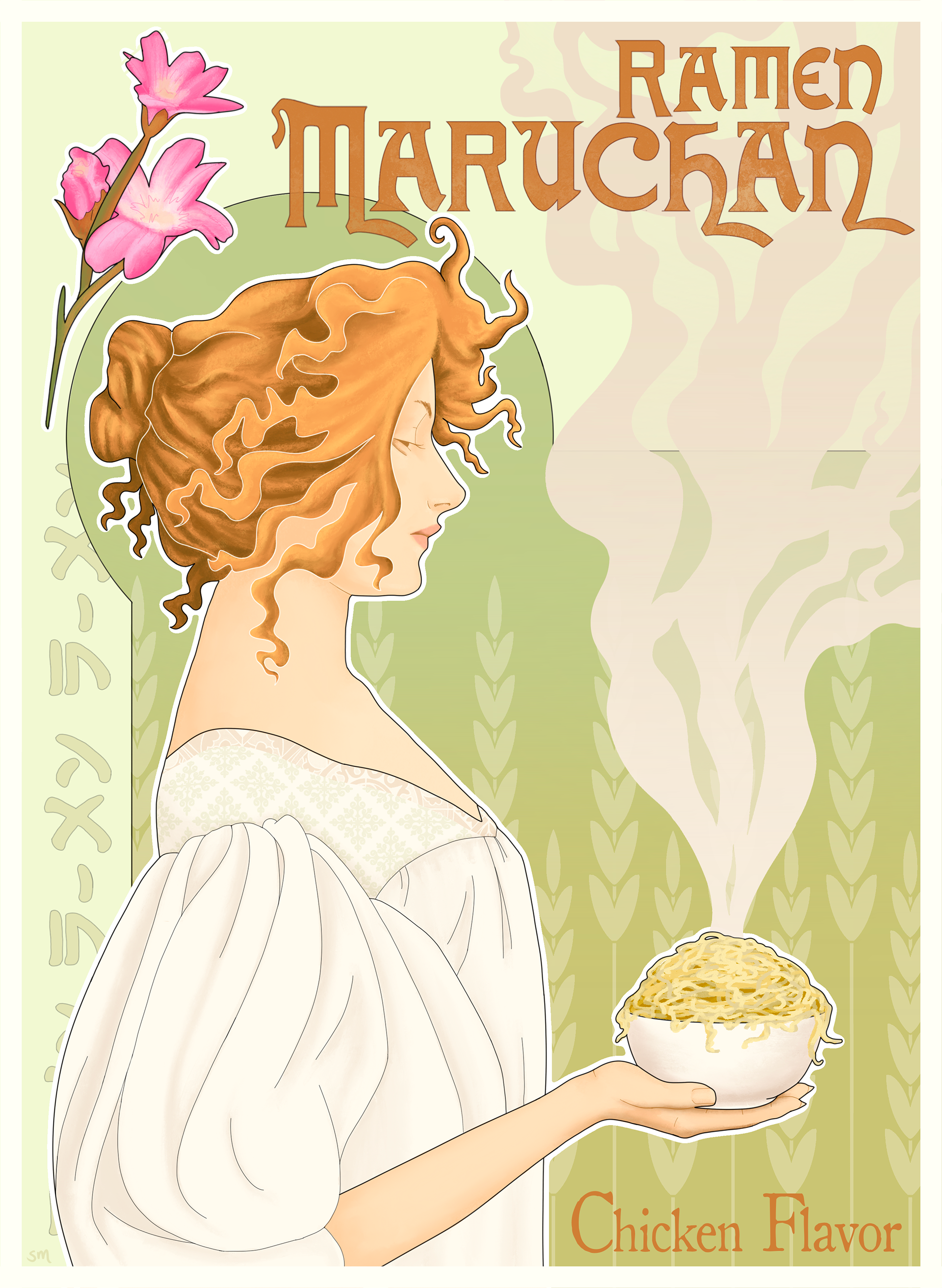
Art Nouveau
Created using Procreate.
Elements of Livemont’s work seen in my piece are most notably the thick white outline and the central woman. Like Livemont’s subjects, she is posed in profile, with graceful features and a messy red up-do hairstyle.
Additionally, there's an arch and plant-like designs in the background of most of Livemont's works. My piece has wheat stalks in the background, the main ingredient of Maruchan Ramen noodles; and a half arch over the women, inspired by Livemont’s Absinthe Robette poster.
On the left side of the border, I included the Japanese characters for “ramen” to take the place of the ornate details common in Livemont’s border designs.
The curling and undulating steam from the ramen mimics the steam in the Absinthe Robette poster.
Finally, I chose decorative art-nouveau text and created a texture-mask to create a "stamped" look, illustrating the look of lithographic typography common of the time.

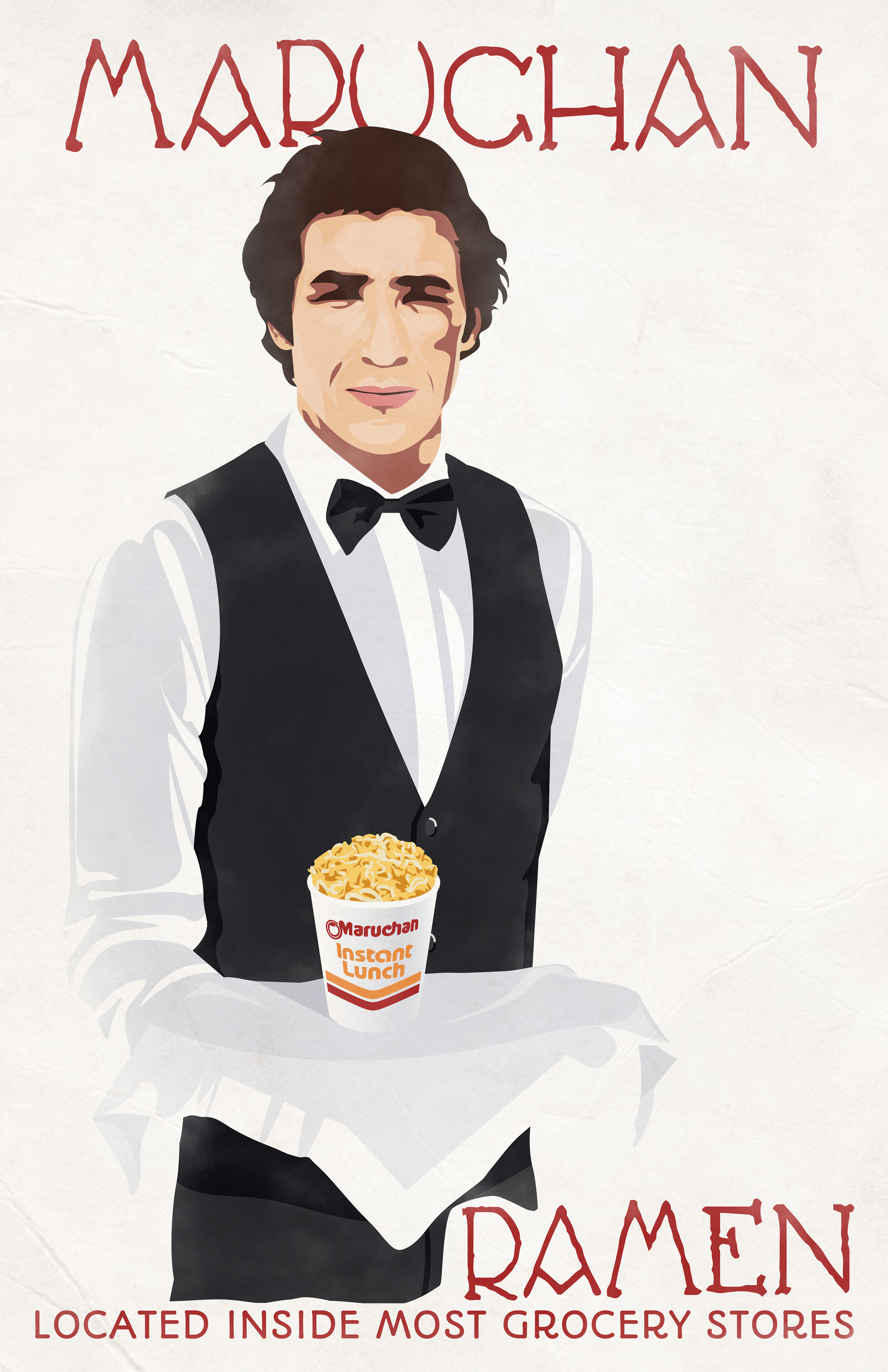
Plakatstil "Poster Style"
Created using Adobe Illustrator and Photoshop.
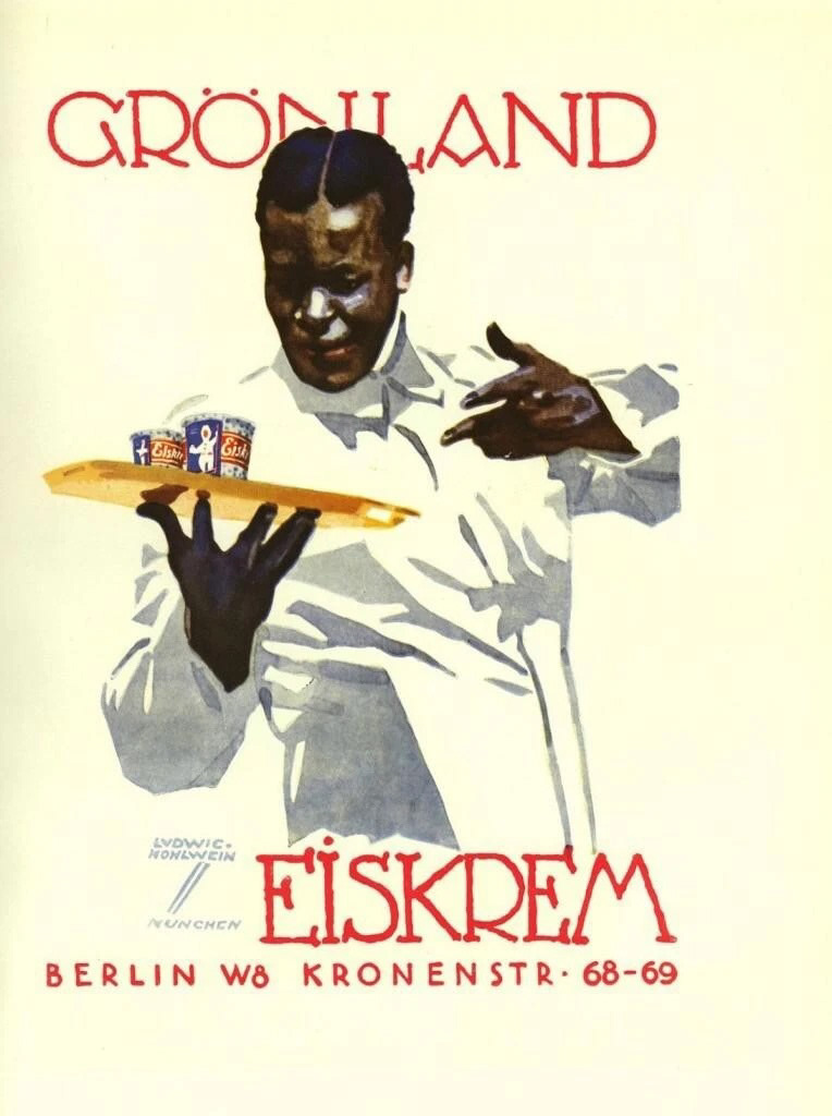
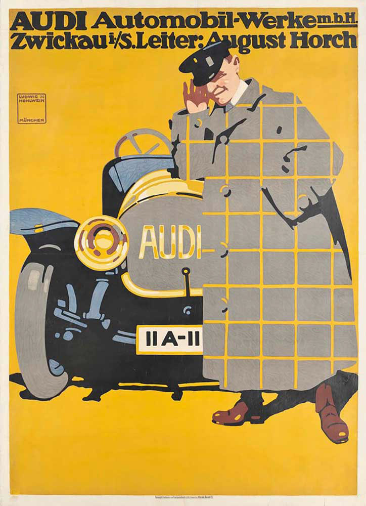
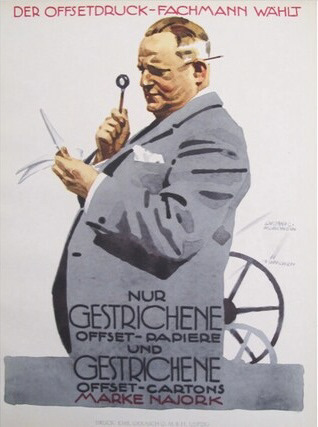
My piece was inspired by three Hohlwein posters in particular: “Der Offsetdruck-Fachmann Wählt,” "Grönland Eiskrem,” and “AUDI.”
I used Illustrator to create the crisp forms and flat shapes. The most notable aspect of Hohlwein’s work present in my work is the fadeaway. I chose to match the highlights of the waiter’s shirt to the background to create this effect.
Furthermore, I noticed that most of Hohlwein’s poster designs include a person that adds glamor and a “high-class” connotation to whatever item is being advertised, hence why I chose to show a waiter presenting the ramen, rather than just drawing the ramen alone.
I used a limited, subdued color palette as well as stylized the man. I noticed in a lot of Hohlwein’s work the figure’s eyes are very abstract and shadowed, especially seen in the “AUDI” poster, and overall he used subdued colors, with an occasional “pop.” I referenced the “Der Offsetdruck” poster when drawing the shadows in the shirt jacket and vest, making sure to create a more 2D appearance. The vest buttons are styled after the driver’s coat in the “AUDI” poster.
For the typography I referenced the “Gronland” poster, mimicking the decorative and hand-drawn characters.
Lastly, I uploaded my work to Photoshop to create a watercolor/lithography texture in it. This watercolor-esque texture is most noticeable in the “Gronland Eiskrem” piece, in the lower left shadow of the man's shirt.
Grønland Ice Cream, Hohlwein, 1926
Audi, Hohlwein, 1912
Der Offsetdruck-Fachmann Wählt, Hohlwein, 1926
My Design

My Design
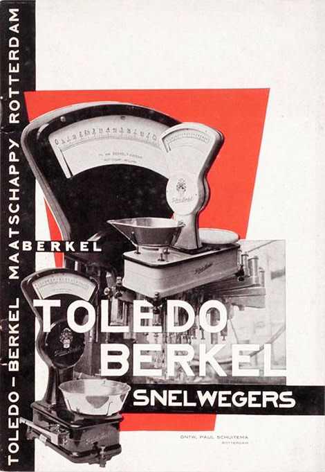
Toledo Berkel Express Weighing Machines, Schuitema, 1927
Constructivism
Created using Adobe Photoshop.
I was inspired by the Toledo Berkel Express Weighing Machines piece by Paul Schuitema from 1927. I used a limited palette, consisting only of black, red, white, and gray tones.
I added a cut-out bowl of ramen on top of a bright red shape to create his photomontage effect. In the reference piece, the angular, narrowing geometric red shape references the shape of the top of the scale photograph. In this manner, I made my red shape a circle to allude to the shape of the ramen bowl, which works to lead the eye between the two. Additionally, this adds symbolism to my piece: Maruchan Ramen is originally from Japan, and the red circle on a white background directly connects to the Japanese flag.
Lastly, the typography: like Schuitema, I used sans-serif type in all capital letters, with no line weight variation. For Schuitema, it was important that “objective photography was integrated with typography as part of a total structure” (Meggs 365). The blocky type in all capitals creates an unbroken line, allowing the text to be incorporated more cohesively into the composition.

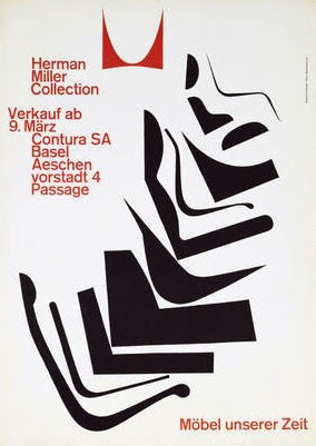
International Typographic (Swiss)
Created using Adobe Illustrator.
For my piece, I used Hofmann’s 1962 poster for Herman Miller Furniture as inspiration and reference. Hofmann’s poster uses a limited three-color palette: black, white, and red. My poster also has a limited palette, except I chose wheaty yellow instead of red to match the noodle color.
The black shapes in Hofmann’s poster suggest the “shapes and silhouettes of Herman Miller chairs [cascading] through space” (Meggs 304). Mimicking this, the yellow shapes in my poster convey the shapes of Maruchan Ramen noodles.
Both the black furniture shapes and the yellow noodles are anchored to the page by the corresponding red type. I matched the layout and typography by using a
left-justified sans-serif typeface.
left-justified sans-serif typeface.
Additionally, I alluded to the original red logo shape by placing a red photo of ramen packaging in its place that mimics the same concave shape.
My Design